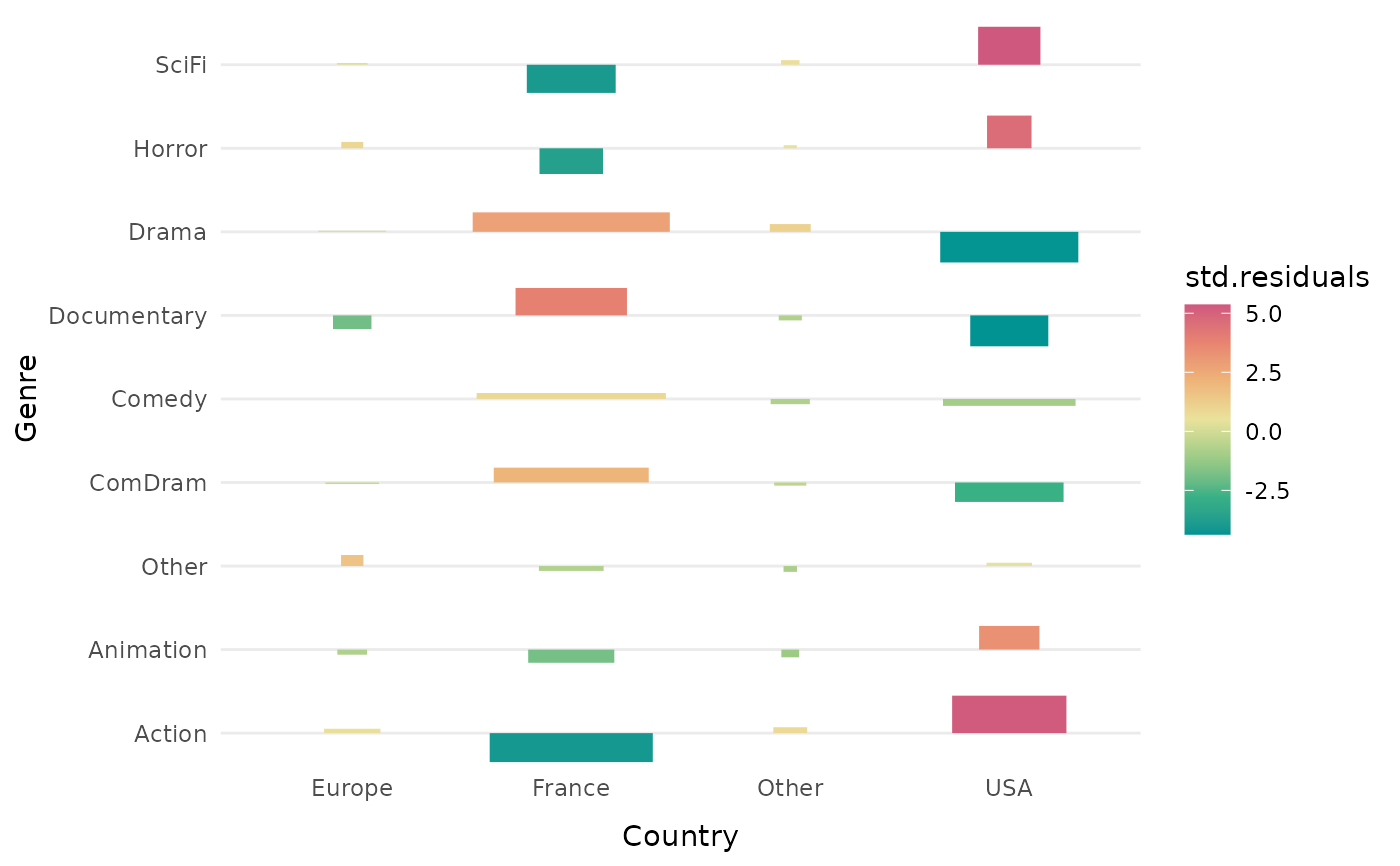
Association plot
ggassoc_assocplot.RdFor a cross-tabulation, plots measures of local association with bars of varying height and width, using ggplot2.
ggassoc_assocplot(data, mapping, measure = "std.residuals",
                  limits = NULL, sort = "none",
                  na.rm = FALSE, na.value = "NAs",
                  colors = NULL, direction = 1, legend = "right")
Arguments
- data
dataset to use for plot
- mapping
aesthetics being used. x and y are required, weight can also be specified.
- measure
character. The measure of association used to fill the rectangles. Can be "phi" for phi coefficient, "or" for odds ratios, "std.residuals" (default) for standardized (i.e. Pearson) residuals, "adj.residuals" for adjusted standardized residuals or "pem" for local percentages of maximum deviation from independence.
- limits
a numeric vector of length two providing limits of the scale. If NULL (default), the limits are automatically adjusted to the data.
- sort
character. If "both", rows and columns are sorted according to the first factor of a correspondence analysis of the contingency table. If "x", only rows are sorted. If "y", only columns are sorted. If "none" (default), no sorting is done.
- na.rm
logical, indicating whether NA values should be silently removed before the computation proceeds. If FALSE (default), an additional level is added to the variables (see na.value argument).
- na.value
character. Name of the level for NA category. Default is "NAs". Only used if na.rm = FALSE.
- colors
vector of colors that will be interpolated to produce a color gradient. If NULL (default), the "Temps" palette from
rcartocolorspackage is used.- direction
Sets the order of colours in the scale. If 1, the default, colours are as output by RColorBrewer::brewer.pal(). If -1, the order of colours is reversed.
- legend
the position of legend ("none", "left", "right", "bottom", "top"). If "none", no legend is displayed.
Details
The measure of local association measures how much each combination of categories of x and y is over/under-represented.
The bars vary in width according to the square root of the expected frequency. They vary in height and color shading according to the measure of association. If the measure chosen is "std.residuals" (Pearson's residuals), as in the original association plot from Cohen and Friendly, the area of the bars is proportional to the difference in observed and expected frequencies.
This function can be used as a high-level plot with ggduo and ggpairs functions of the GGally package.
Value
a ggplot object
References
Cohen, A. (1980), On the graphical display of the significant components in a two-way contingency table. Communications in Statistics—Theory and Methods, 9, 1025–1041. doi:10.1080/03610928008827940.
Friendly, M. (1992), Graphical methods for categorical data. SAS User Group International Conference Proceedings, 17, 190–200. http://datavis.ca/papers/sugi/sugi17.pdf